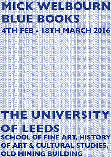
The 5 design options that I had created were all based on Mick Melbourn's exhibition. On all posters, I have experimented with different weights, point sizes, kerning and leading. The idea was to make all the posters the-heavy so that it looks postmodern. I used one colour throughout since it only made sense to use the colour but as it is to advertise blue books. The fourth one, I had used two shades of blue as it would've been difficult to see the larger type without having to make the background type lighter. The last image was suppose to be inspired by a book design; when you open a book, the spine is in the middle so I put words either side of the spine which is the 'BLUE BOOKS'. The bolder type is the information I wanted standing out the most as they were the most relevant to the exhibition.
I used Gill Sans Bold and Regular since it is a sans serif typeface which is considered postmodern. The typeface is also easy to read and works well with the design.
I had achieved what I set out to originally produce. The posters look postmodern and type-heavy which goes with the theme of my essay question. I have experimented with the type settings but have stuck to one typeface design since I didn't want to over-do the design as it would easily look tacky as I was aiming for a clean, distinct and minimal design. The varied range of different type settings gives the design character and look more playful. I would've however, experimented with trying more than two different angles such as Paula Scher usually does in her artwork.


No comments:
Post a Comment