Thursday, December 10, 2015

Establishing the requirements of the practical investigation

Rationale:
1.What is your research question?
How does Postmodernism affect Graphic Design Practice?
2. Do you have a hypothesis (an assumed conclusion that you will endeavour to prove)?
Modernism vs. Postmodernism and how it has affected new and established designers.
3. What are the contexts of your research interests (politics, advertising, consumerism)?
Postmodernism. 
4. Sources of primary/secondary research.
Books and internet research.
5. How will your practical work answer the research question?
Creating a poster using modernist design principles but make it so its relevant to postmodernism. 

6. What methods will you use to research, develop, create and test your work?
I will look at modernist designers and incorporate inspiration from postmodern designers into my final practical design to make it postmodern. I will test my work by evaluating the modernist styles and postmodernist styles to see if they are relevant to my question.

7. Provide a proposed timeline for your work to completion (consider carefully whether you will need access to college facilities).

Tuesday, December 1, 2015

How did postmodernism impact on Graphic Design practice?

"How did postmodernism impact on Graphic Design practice?"Postmodernism is an art movement that was realised in the 1980s but really got started in the late 20th century and was widely know in Europe and especially in America during the 1980s and 1990s. Many people knew that postmodernism was about to happen because by the late 1960s, modern design and beliefs became irrelevant in the emerging new society. The art movement is represented by using and mixing various different types of media and styles in art design that opposes general conventions to create new adaptations in art design. People such as architects and designers had welcomed the postmodern era as a cultural change. This had made a positive impact for designers as they it allowed them to become more free by incorporating different elements and styles in their work where it wasn’t idiosyncratic but more personal and open minded. Postmodern design movement had created pop art, collage, digression, surrealism, parody and irony. Postmodern theorists also know it as ‘jouissance’ as the postmodern era has made design less serious and more playful so it felt more pleasurable not prudent.
 In Graphic Design, the ‘new wave’ was about breaking traditions of typography so that you could use different typefaces and have inconsistent spacing and positioning between letters.
'It was a sign that design was beginning to break from its mooring, question its commitments to rationalism and determinacy and take an increasingly unfixed and open-ended new forms.'[1]The author is saying it as he is re-living this great experience as the quote suggests that postmodernism had a positive impact on graphic design as everything in the design world started to change in terms of new media, therefore had affected the production of graphic design practice. Graphic design had become increasingly popular to new opportunities and began to break away from its solidarity and people began to question the philosophy of graphic design as postmodernism made it more exciting and revolutionary. The excitement was unquestionable as people were so fascinated to see the postmodern era such as the new wave and the extensive styles as it gave endless variety of new options to choose from. The quote also implies it was time for a new change and a new beginning in graphic design because it was inevitable, people were simply waiting for it to happen, and when it did, it was substantial. The break through of postmodernism meant that designers could create something different without having to stick to a certain set of modernist rules which made design more exciting and interesting.
“Postmodernism's distinctive character lies in this kind of wholesale "nudging" commitment to doubleness, or duplicity. In many ways it is an even-handed process because postmodernism ultimately manages to install and reinforce as much as undermine and subvert the conventions and presuppositions it appears to challenge. Nevertheless, it seems reasonable to say that the postmodern's initial concern is to de-naturalize some of the dominant features of our way of life; to point out that those entities that we unthinkingly experience as "natural" (they might even include capitalism, patriarchy, liberal humanism) are in fact "cultural"; made by us, not given to us.”[2]“Some of those strategies postmodernism borrows from modernism, in particular its self-consciousness and self-reflexivity, as well as its questioning of such Enlightenment values as progress, science, and empire or such nineteenth-century values as bourgeois domesticity, capitalism, utilitarianism, and industry.”[3]


[1] Poynor, R. (2003) No More Rules. London: Lawrence King - Postmodernism[2] Felluga, Dino. "Modules on Hutcheon: On Parody." Introductory Guide to Critical Theory. [Last update 31 January 2013] Purdue U. [Accessed 23 November 2015] <http://www.purdue.edu/guidetotheory/postmodernism/modules/hutcheonparody.html>. [3] Felluga, Dino. "Modules on Hutcheon: On Postmodernity." Introductory Guide to Critical Theory. [Last update 31 January 2013] Purdue U. [Accessed 23 November 2015] <http://www.purdue.edu/guidetotheory/postmodernism/modules/hutcheonpostmodernity.html>

Wednesday, November 25, 2015

Consumerism

Persuasion, society, brand and culture.

Sigmund Freud (1856 - 1939)
- New theory of human nature
- Psychoanalysis
- Hidden primitive sexual forces and animal instincts which need controlling
- Fundamental tension between civilisation and the individual
- The Pleasure Principle

Edward Bernays (1891 - 1995)
- Press agent
- Employed by public information during WW1
- Post-war set up 'The Council on Public Relations'
- Birth of PR
- Based on the ideas of Freud (his uncle)
- 'Torches of Freedom' 1929 Easter Day Parade

Fordism
- Transposes Taylorism to car factories of Detroit
- Assembly line
- Standard production models built as they move through the factory
- The model T Ford 1908 - 1927
- 1910 - 20,000 produced and sold at $850

The consumer self allures audiences as it gives you an idea that your making yourself more desirable.

Vance Packard 1957 - Marketing hidden needs
Selling:
- emotional security
- reassurance of worth
- ego-gratification
- creative outlets
- love objects
- sense of power
- sense of worth
- immortality

'Manufacturing Consent' 1920
A new elite is needed to manage the bewildered herd

Walter Lippmann - 'Public Opinon'

The Great Depression - social bankruptcy
Roosevelt 'The New Deal' (1933 - 36)

'Democraticity'

Consumerism is an ideological project


Thursday, November 19, 2015

Digital Culture and Distribution

Mechanical introduction 1436 - Gutenberg's printing press.

1919-1933 - Integration of mass production.

1990 - Digital design/production - Apple Macintosh.

Mobilisation of digital communication.

The digital aesthetic - digital visualisation.

Technological and analogue aesthetic.

Utopia v Distopia.

Nostalgia v Innovation.

Tim Berners-Lee - Created the World Wide Web in 1990

Internet Explorer was created in 1995

The evolution of nine technology has affected the way we communicate with other people.

Tuesday, November 17, 2015

Print Culture and Distribution

'Late age of print' term comes from the media theorist Marshall McLuhan.

Gutenberg's printing press.
The 'age of print' began around 1450.

John Martin (1820) reproduced his own work using print and began to become richer as his work became more expensive.

Matthew Arnold (1867) 'Culture & Anarchy' Culture is:
- 'The best that has been thought and said in the world'.
- Study of perfection.
- Attained through disinterested reading, writing and thinking.
- The pursuit of culture.
- Seeks 'to minister the diseased spirit of out time'.
Culture - rich people.
Anarchy - working class people taking over.
The working class 'raw and half developed'.

Leavisism - F.R. Leavis & Q.D. Leavis
Mass Civilisation & Minority Culture
Fiction and the Reading Public

Culture and Environment.

Standardisation and leveling down.

Collapse of the traditional authority comes at the same time as mass democracy (anarchy).

Nostalgia for an era when the masses exhibited an unquestioning deference to (culture) authority.

Popular culture offers addictive forms of distraction and compensation. C19th. Penny Dreadful.

Walter Benjamin 'The work of Art in the Age of Mechanical Production' 1936.

Art is a cult.

Print Capitalism 1842.

William Morris (1877) 'The Lesser Arts'
Mechanical vs. Intellectual.

Tuesday, November 3, 2015

Planning & structuring an essay

Question: "How did postmodernism impact on Graphic Design practice?"
5 bibliography sources

  • Poynor, R. (2003) No More Rules. London: Lawrence King 
  • Moszkowiz, J. (2013) 'Re-Learning Postmodernism in the History of Graphic Design: a (con)textual analysis of Design Journal in the late 1960s', Journal of Design History, Vol. 26. No. 4.
  • Barrett, T. (1997) 'Modernism and Postmodernism: An Overview with Art Examples' in Art Education: Context and Practice in a Postmodern Era. 
  • Felluga, Dino. "Modules on Hutcheon: On Parody." Introductory Guide to Critical Theory. [Last update 31 January 2013] Purdue U. [Accessed 23 November 2015] <http://www.purdue.edu/guidetotheory/postmodernism/modules/hutcheonparody.html>. https://www.cla.purdue.edu/english/theory/postmodernism/modules/hutcheonparody.html
  • Felluga, Dino. "Modules on Hutcheon: On Postmodernity." Introductory Guide to Critical Theory[Last update 31 January 2013] Purdue U. [Accessed 23 November 2015] <http://www.purdue.edu/guidetotheory/postmodernism/modules/hutcheonpostmodernity.html>.https://www.cla.purdue.edu/english/theory/postmodernism/modules/hutcheonpostmodernity.html
I will analyse how postmodernism affected industry practitioners, looking at the effect on both established and emerging designers.

Graphic Design that I will analyse


Essay map
  • Impact of postmodernism - research the general affect of postmodernism and how it had also affected Graphic Design
  • Positive affect of postmodernism in Graphic Design
  • Negative affect of postmodernism in Graphic Design
  • Reactions of new and existing designers during the early stages of postmodernism 
  • Analysis of Graphic Design work

Thursday, October 29, 2015

Chronologies 1 - Type: Production & Distribustion

Type is a modern obsession, there are many types such as:
  • Old style
  • Transitional 
  • Modern
  • Slab serif
  • Humanist sans serif 
  • Gothic (blackletter)
Type is what language looks like.
Typography is the craft of enduring human language with a durable visual form.

Mesopotamia (ancient sumer) 3200 BCE (and Mesoamerica around 600 BCE)
Occidental (western)

All that is necessary for any language to exist is an agreement amongst a group of people.

True alphabets consistently assign letters to both constants and vowels on an equal basis.

The first true alphabet was the Greek alphabet, which was adapted from the Phoenician.


Pictures developed into diagrams which then made symbols and finally, letters.

The alphabet was made by the verbal language in written form. 

It doesn't matter what order the letters are in a word, as long as the first and last letters are in the correct place, we can still read it correctly. This is because the mind reads the word as a whole and not individually. 

Typography is the art and technique of printing with movable type, composition of printed material from movable type and the arrangement and appearance of printed matter.  

Types of classification:
  • Humanist
  • Garbled
  • Didone
  • Transitional 
  • Lineal
  • Mechanistic
  • Black letter
  • Decorative 
  • Script
  • Manual
Timeline classification:
  • Classical/old style - 1450-1700
  • Transitional - 1700-1790
  • Modern - 1790-1870
  • Bauhaus/Swiss modern - 1870-1960
  • Contemporary - 1960-2000
1450 - Johannes Gutenberg brought out the printing press around 1436.

1870 - William Foster was a huge influence on type as he put in a law to say that education was compulsory, this is called the Elementary Education Act 1870.

1919 - Walter Gropius 

1957 - Max Miedinger & Eduard Hoffmann 

1990 - Steve Jobs. The Apple Macintosh was first released on October 15th 1990. It came with a mouse and was under $1,000 making it affordable and easy for the public to use. This is when type design was introduced in digital technology. 

'By making itself evident, typography can illuminate the construction and identity of a page, screen, place or product'. - Ellen Lupten - Thinking With Type

Gotham type is a famous type used for President Obama's posters.

"Since typography is a communication method that utilises a gathering of related subjects and methodologies that include sociology, linguistics, psychology, aesthetics, and so much more... there is no single approach within typography that applies to everything." - Shelley Gruendler

I thought the development of how the alphabet came to be was the most interesting part of the lecture as I wouldn't really think about this but just accept that the alphabet evolved. I also didn't know that it was adapted by the Phoenician alphabet. I also wasn't aware that there are ten classifications of type and when they came to be.

Tuesday, October 27, 2015

Summarising and paraphrasing

Question: "How did postmodernism impact on Graphic Design practice?"

Poynor, R. (2003) No More Rules. London: Lawrence King - Postmodernism

'It was a sign that design was beginning to break from its mooring, question its commitments to rationalism and determinacy and take an increasingly unfixed and open-ended new forms.' (Page 21)

The author is saying it as he is re-living this great experience as the quote suggests that postmodernism had a positive impact on graphic design as everything in the design world started to change in terms of new media, therefore had affected the production of graphic design practice. Graphic design had become increasingly popular to new opportunities and began to break away from its solidarity and people began to question the philosophy of graphic design as postmodernism made it more exciting and revolutionary. The excitement was unquestionable as people were so fascinated to see the new wave and the extensive styles as it gave endless variety of new options to choose from. The quote also implies it was time for a new change and a new beginning in graphic design because it was inevitable, people were simply waiting for it to happen, and when it did, it was substantial.

Tuesday, October 20, 2015

Reading and Understanding Text

Question: "How did postmodernism impact on Graphic Design practice?"

Poynor, R. (2003) No More Rules. London: Lawrence King - Postmodernism

5 key quotes:

  1. 'The use of postmodern graphic design as a contained stylistic category is misleading because it implies that the design that succeeded it in stylistic terms no longer has a relationship with postmodernism.' (page 18)
  2. 'It was a sign that design was beginning to break from its mooring, question its commitments to rationalism and determinacy and take an increasingly unfixed and open-ended new forms.' (page 21)
  3. 'Early responses to the new wave were often negative. Older designers, accustomed to rigorously suppressing the personal, registered concern at the eruption of wayward subjectivity and resisted the idea.' (page 26)
  4. 'Graphic design was in this fundamental sense an aspect of subculture, a creative tool by which young people communicated amongst themselves. Their designs were not intended to be meaningful for those on the outside, including designers positioned in the mainstream, and the design profession was consequently slow at first to acknowledge the significance of work that seemed frivolous and marginal to the concerns of visual communication as an ever-expanding business.' (page 33)
  5. 'In short, the design fulfills all the requirements of Jencksian postmodernism it is a hybrid, double-coded and represents a partial return to tradition, though its disjunctive quality ensures that it can only be read as a product of a playful, contemporary design sensibility.' (page 35)


5 key points:

  1. Postmodern graphic design being called stylish is wrong because it suggests that design has only become stylish during postmodernism.
  2. Everything in the design world started to change since new ways of designing such as the change in technology had effected the way design was produced. 
  3. Older designers couldn't take on the new wave as they have been keeping to traditional values of designing and found it difficult to keep up to date with the new material. 
  4. People usually didn't take much notice/have an opinion about the deeper meaning behind the design yet they acknowledged and noticed the artists work. The designers work was not intended for the everyday person but for the designer that would understand the meaning behind the image.
  5. People can look at design and just see the creation but others can also find the deeper meaning behind it therefore is a hybrid. The design is not to offend but is playful and should not be offensive.

Monday, October 19, 2015

Finding research sources

How did Postmodernism impact on Graphic Design? - What is Postmodernism?

'In the postmodern world, people are no longer convinced that knowledge is inherently good. In eschewing the Enlightenment of inevitable progress, postmodernism replaces optimism of the last century with a gnawing pessimism. Gone is the belief that every day, in every way, we are getting better and better...the continued existence of human kind is dependant on a new attitude of cooperation rather than conquest.' (Grenz, S J 1996:7)

The author is saying that Postmodernism is a new way of life and people are more accepting of others; wether they are smart or not; whether they have good jobs are not. Postmodernism is about accepting everyone for the way they are and not judging people purely on what they do or their intelligence. We are evolving everyday, getting better and better through time. People should be more caring and accepting of others, not try and be better than them or showing off if you are better off than them. Postmodernism is a positive change and it should continue to be rather than trying to compete with others.

Green, S J. (1996) 'A Primer on Postmodernism' Grand Rapids, Michigan, Eerdmans, p. 7. [Web]. Available on: https://books.google.co.uk/books?id=gBTTKIqz5mEC&printsec=frontcover&dq=postmodernism&hl=en&sa=X&redir_esc=y#v=onepage&q=postmodernism&f=false (Accessed 19 October 2015)

Sunday, October 18, 2015

A 20,000 Year Non-Linear History of the Image


Rothko Chapel, Houston, Texas - opened in 1971
People that have visited the Chapel have described the feeling of looking into the painting is like looking into the void or into the cosmos because it makes you feel empty. A common experience is when people say that when you look at it, it makes you overcome with emotion where you start crying so maybe the images have a deeper meaning behind them? Or maybe you are expected to cry because it seems to be a popular reaction to looking image and because its more 'respectful'?
Papal Alter & Frescoes, interior of the Basilica of San Francesco d'Assisi, C.1230 Umbria, Italy
One reason why people go to this gallery is because its like going to Pilgrimage/ a higher religious place because it makes you feel poorer, whether from money or religion.

Leonardo Da Vinci: Mona Lisa, Installation View, Louvre, Paris
Some people believe this artwork has a false sense or originality and therefore should be not be a popular or as hyped about than it is.
Banksy (2013) Mona Lisa Mujahideen, London
This graffiti art is an explicit reference to the challenging traditional art to make it more relatable in todays society.
Jackson PollockHis paintings are creating in his unconscious mind which is makes his work popular. The CIA continued to fund his artwork as they believed that it represents the free mind of the Western world. 
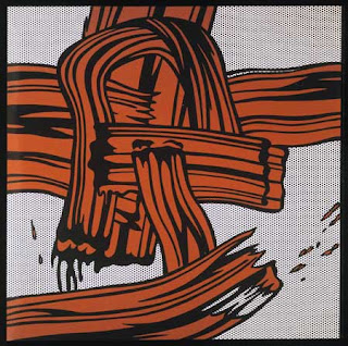
Roy Litchenstien (1965) Red Painting
He made a mockery of Jackson Pollock's work as he thought it was ridiculous that splashing paint has a religious or spiritual meaning. He uses popular culture to attack high culture.
Guerrilla Girls (1985)
The history of art has always been dominated by (western) males in the industry. They wanted to challenge sexism and discrimination and the banish the idea that the only women that were allowed to be in galleries in the 80s had to be nude employees.

This lecture was very thorough about the challenges artists faced in the art industry. It has also shown me ways in what art meant to people and how other artists challenge each other by mocking their artwork.

Friday, October 9, 2015

Image Analysis Exercise


The Uncle Sam Range (1876) Advertisement image by Schumacher & Ettlinger, New York.

This poster was used to advertise cookware and is aimed at wealthy, upper class people because Uncle Sam is considered as a popular figure and important, which links into luxury therefore working class people wouldn't be able to afford this.

It has very powerful figures such as Uncle Sam because everyone knew who he was and was used a vast amount in posters to promote the war and to get males to join and win the war. This itself would immediately draw attention to the audience as Uncle Sam is a heroic figure that helped them win the war which therefore means that if he is included in the poster, audiences know that they can rely on cookware if Uncle Sam is included on it. The way Uncle Sam is sat is very confident - almost arrogant which shows to the audience that 'if you get this cooker you can do eveything' It is a very patriotic all-American advertisement as it uses the red, blue and white all over the image and also the popular stars and strips seen on the the American Flag and the eagle. This, the framed declaration of independence and the clock that states 1676 and 1776 reinforces America's 100 years of independence makes it come across that they are smug and they feel more superior than other countries because they have to plastered it around everywhere to show what they have gained by themselves. 'The Uncle Sam Range' is in a cowboy/Texan style type which solidifies the American representation. It is typed in gold so it shows that this product is only the best and high quality so it would appeal to its rich audiences.

In the left-hand corner of the image, you can see a small black male. He is small as he is made to look insignificant and unrecognisable because it shows he doesn't matter. He is used on the to show that if you get this cooker, you can make anything without having to do everything - almost tying to say that you get a servant slave with the cooker because that's how little you need to put in towards with this cooker. This also reinforces the idea that the cooker range is aimed towards the upper class as they we wealthy enough to own slaves.

Uncle Sam is joined at a dinner party with England and the West which shows that America can feed the world with all its resources and how rich they are in food. He is showing off all their goods and being cocky about it. The person on the right (world) is looking at a menu that Uncle Sam has presented to him and it is making fun out of other world cuisines in ways that can be seen racial or offensive to the other countries. For example for Ireland, it says 'Potatoes. Fried Boiled Stewed Roasted Baked Mashed Raw.' It belittles other countries and makes them feel embarrassed about what they eat because America is showing off that they can have anything they want and have stereotyped other countries in what they think they can only eat/show the lack of food they have compared to America. Again, its saying that Uncle Sam (America) can feed the world. The way that the face is on Africa shows that they were desensitised to the fact that Africa was poor and did not have much food and it shows that even though Uncle Sam is making fun of the menu, Africa is still suffering and would take all they can from the menu or it could show that he is rubbing it in Africa's face that they have luxury food and Africa doesn't even have basic food.

December 1930
January 1931


Empire Marketing Board - 'East African Transport Old Style' and 'East African Transport New Style' by Adrian Allison, from the 'Colonial Progress Brings Home Prosperity' series of posters. 

These two images as one is trying to say that colonialism has been a positive change as the bottom image is meant to look like they aren't working as hard as the top image to transport goods. These posters are aimed at the British Empire as it is trying to 'inspire' other people to do the same things in Africa because they think that it would benefit the natives.

The top image (Old Style) shows a line of women and their children transporting their goods. The image is negative as it shows that they are unhappy and almost like they are suffering, the artist may have wanted it to come across that females are weak and are stereotyping that females are not meant to do these types of jobs. The land looks very deserted and there doesn't seem to be any villages for miles other than the fields, this is also maybe why the women look so unhappy, they might have been walking for a while.

The second image (New Style) shows a more man made Africa. You can see that there is a bridge, boats, car and a path. This is a propaganda image because it is saying that since white men have taken over, they have made the natives' lives easier because they can transport easier with man made aspects. The whole image has been Westernised because they have gave the idea that men are the dominant gender, therefore there are only men in the image, they are wearing shorts as opposed to the top image of where the women are wearing pieces of material. There is also a dominant white male looking confident and in power. This shows that he may be the one that have made their lives 'easier' as his clothes represent his wealth. The image still like the first one shows that the natives are still the ones slaving away so really their lives hasn't got much easier.

Both images of the 'The Uncle Sam Range' and 'Colonial Progress Brings Home Prosperity' are aimed a upper class wealthy white people (predominantly men). Both counties are saying that they are more prosperous than others (culturally superior) and they are celebrating the growth of their empires. They both are adverting something that they will think will benefit them and others around them. Both images use racism as they both include black people slaving away while the white people are made to look calm, serene and relaxed and they both show how white is the dominant race and are the ones in power. Both posters are hyper-reality in which they make life seem better with what they can offer and that black people are slaves whilst white people are all rich - making it seem natural and normal to know this. It also shows that men are the dominant gender as they seem to hold all the power by the lack of females in the posters.

However, 'The Uncle Sam Range' is about America is all about benefiting themselves and showing off what they have achieved. The poster is heavily American and it comes off that they are conceded and have a huge ego and are only wanting to promote their cooker and is selling it by saying this is what they need to become a true American or if your not American, this will make you American. It is very complacent.

The 'Colonial Progress Brings Home Prosperity' is not specifically heavily about the British Empire but want to show that this is what they can do to show their power and how colonialism can 'benefit' others.

Wednesday, October 7, 2015

Visual Literacy - The Language of Design

Visual communication is the process of sending and receiving messages using type and images.

Visual literacy is the ability to construct meaning from visual image and type.


Principle 1 - Visual literacy can be interpreted, negotiated and information can be found in something in the form of an image.

Principle 2 - Visual literacy is based on the idea that literacy can be read.

Principle 3 - In visual literacy, it is necessary for any language to exist as an agreement amongst a group of people that one thing will stand for another.

Principle 4 - Visual language is made up of presentational symbols whose meaning results from their existence in particular contexts.

Principle 5 - Requires the awareness of the relationship between visual syntax and visual semantics.

Visual syntax of an image refers to the pictorial structure and visual organisation of elements. It is represented by basic building blocks.

Visual semantics of an image refers to the way an image fits into a cultural process of communication. This includes the relationship between form and meaning and the way the meaning is created.

Visual synecdoche is a term applied when part is used to represent the whole, or vice versa.

Visual metonymy is a symbolic image that is used to make reference to something with a more literal meaning.

Visual metaphor is used to transfer the meaning from one image to another.

Symbol (logo)
Sign (identity)
Signifier (brand)

I have learnt that we are not conscious about symbols as we automatically know what something means or something stands for. I've also learnt how just by changing the slightest part of a symbol such as the colour can impact dramatically on the meaning of the symbol.